Reimaging Our Digital Presence
The new and improved Terrostar site was a long time coming. You know it is bad, when you cringe every time someone references your website. Like most agencies, we were so worried about our clients we didn’t have a chance to work on ourselves. When we finally put a deadline to paper we we able to start reimagining our digital presence. But before I started creating design concepts, we met as a team and discussed our goals and design initiatives for the project. Here is what we came up with:
Incorporate More Movement
Our previous design was not only static, but it didn’t utilize any of the newer technologies provided to us. To help tell a better story visually, we incorporated parallax scrolling elements. This can help users digest and read the information as they scroll. The fluid aspect, of fading in text and images, can give a site much more depth and enhance the user experience.
Explore Animations
While an image can truly speak volumes, animations can add more dimension. As a designer new to animating, I wanted to keep the visuals simple and subtle. The animation on the banner of our homepage is just that, simple. We wanted something that reinforced our brand image, and spoke to our logos constellation reference without being too “flashy.”
Another small animation was in the scrolling screenshots we featured on our portfolio pages. While still subtle, the scroll gives users the ability to view an entire page, not just a screenshot.
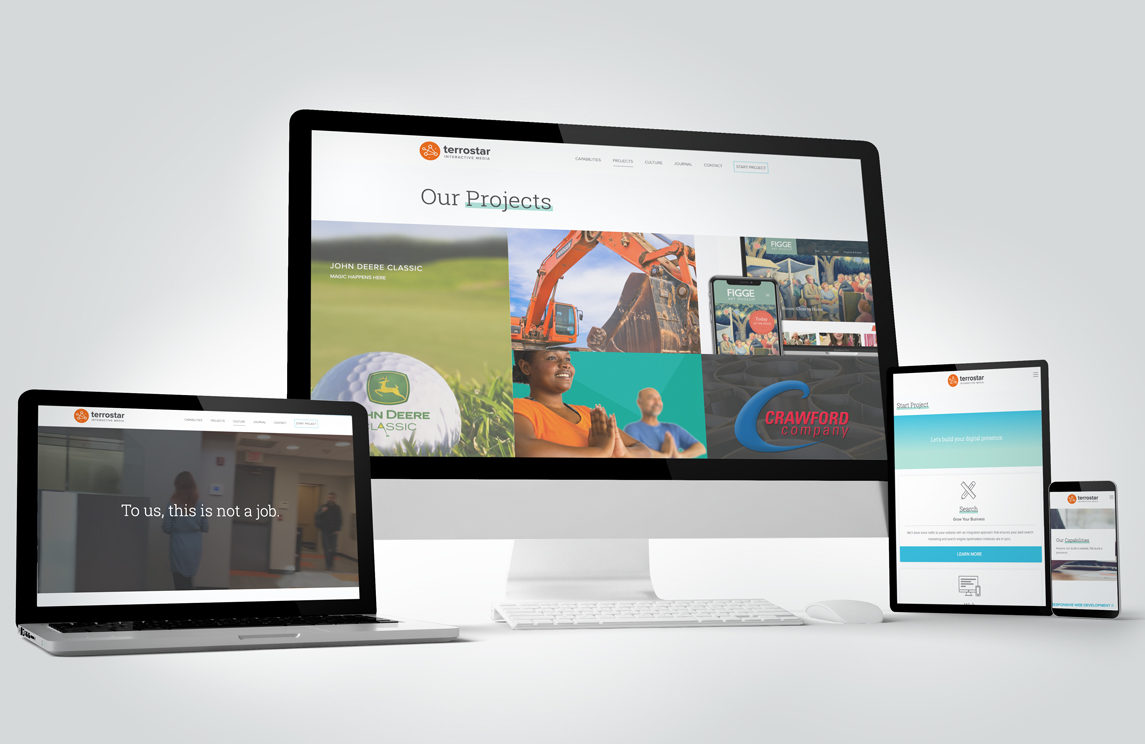
Expand Portfolio
Previously, our portfolio felt stagnant and didn’t speak to the variety of industries we served.To better showcase our diverse clients we wanted to use more horizontal space, and expand the images. We wanted to avoid just showing a screenshot of the website, but we wanted to highlight elements we used throughout the project. This helped us tell a better story of our various client partnerships.
Highlight Our Work Culture
I love where I work. The unique individuals I get to work with on a daily bases are truly a gift. You won’t meet a more passionate, talented group of people. The only way to show this was to give our culture page more love. We wanted our clients to know who they were partnering with, and by upgrading this section of our site, we are giving a birds eye view into our day-to-day shenanigans. Side note, don’t let Tom’s serious face deceive you he is one the the nicest guys around, he was just a little camera shy that day.
Our overall theme was to better tell the story of us, while letting you know how we can help you in your digital space. By better showcasing our work, speaking to our mission, and letting our clients tell their story we hoped we would better engage our audience. I am very pleased with the overall design, and our ability to adapt to the every changing and growing digital plain.